
The best ideas can change who we are. Medium is where those ideas take shape, take off, and spark powerful conversations. It's an open platform where 170 million readers come to find insightful and dynamic thinking. Medium's purpose is to spread these ideas and deepen understanding of the world.
In addition to being an open platform, Medium.com also housed 10 internal publications during my time there.
I was brought on as Design Director with one main goal: elevate the design of these publications to present as premium subscription offerings.
This manifested in three main ways:
1. Leading a talented team of Art Directors, Graphic Designers, and a Photo Editor to define and shape the vision for content-level art and design.
2. Contributing expertise in Product Design.
3. Contributing as a key stakeholder and collaborator on the redesign of the Medium brand.
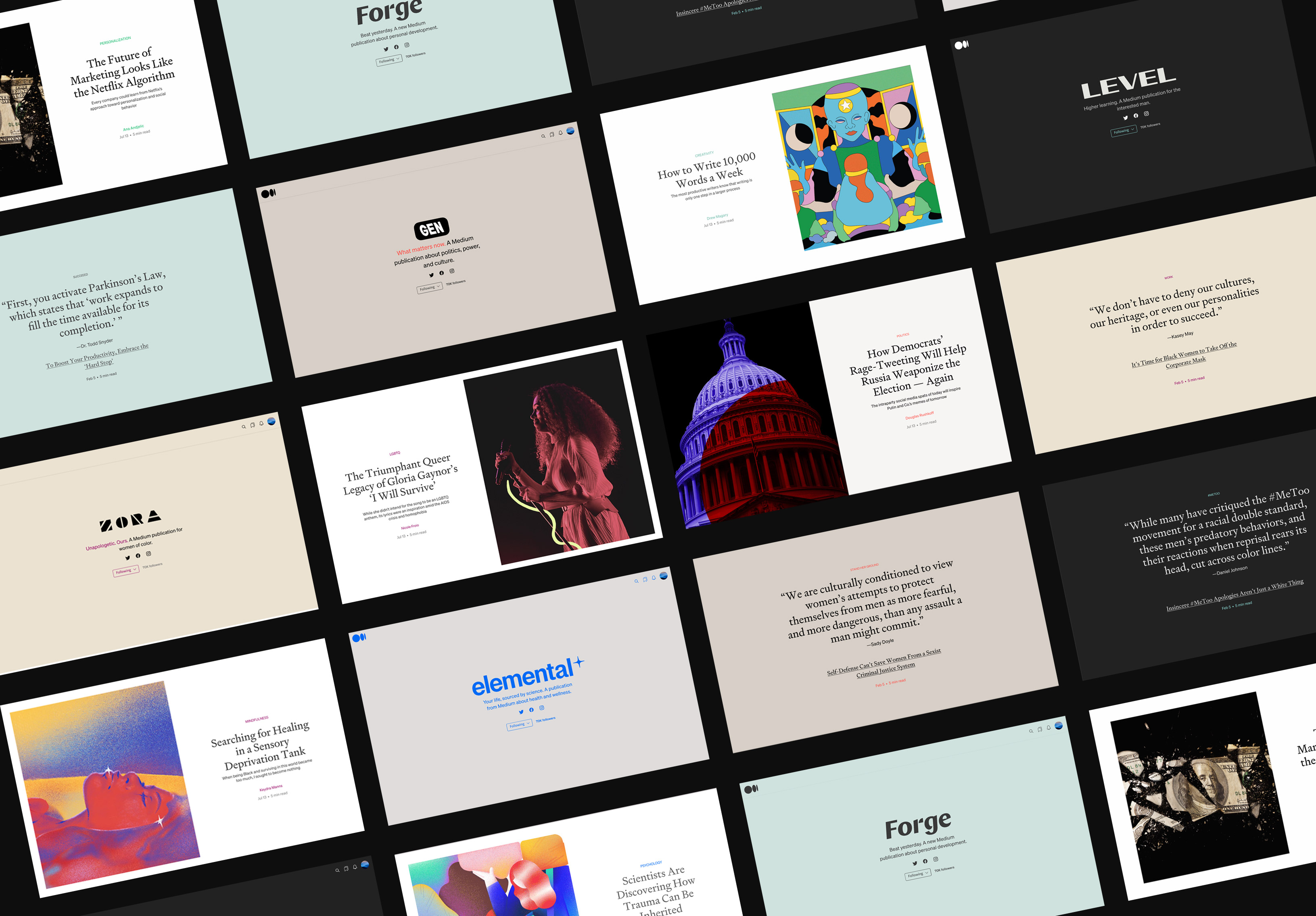
The examples below represent proposed solutions and improvements to the product and brand design system for Medium's owned and operated publication homepages across desktop and mobile web.
This project began with research by conducting interviews with all editorial stakeholders, product and brand leads. It became clear that the objective was for each publication to present as distinct and unique premium subscription offerings, each with their own voice — while simultaneously feeling as part of a family under the Medium brand umbrella.
The strategy for the design system across all publications was to …
—Reduce font-faces across all publications to three. (Fell, Charter and Söhne - there were previously >14 font-faces and styles).
—Reduce clutter by creating more negative space, particularly vertical spacing of elements.
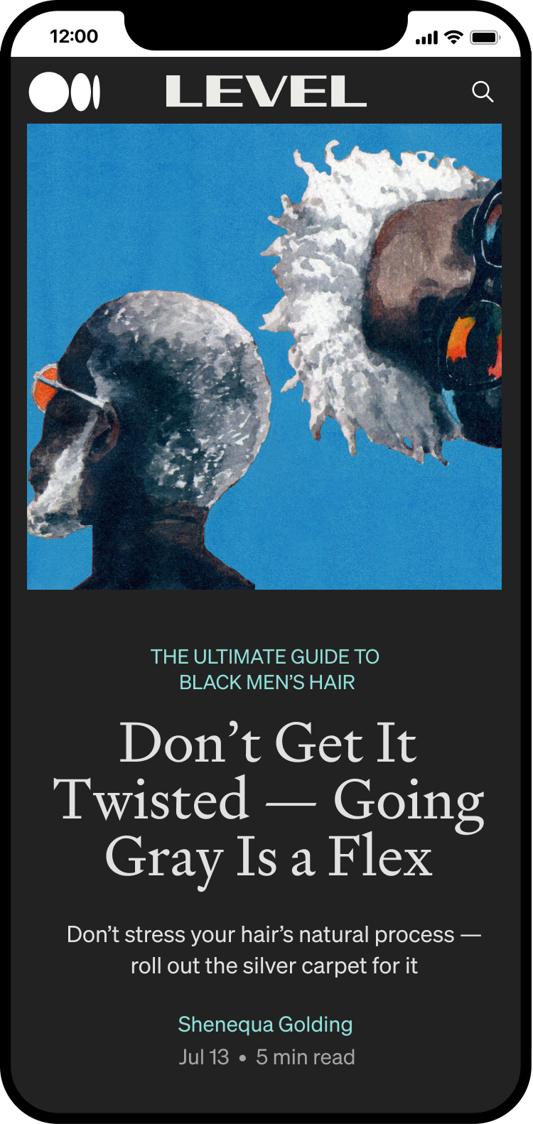
—Leave room for publication brand expression through their word mark, color palette, and artwork.
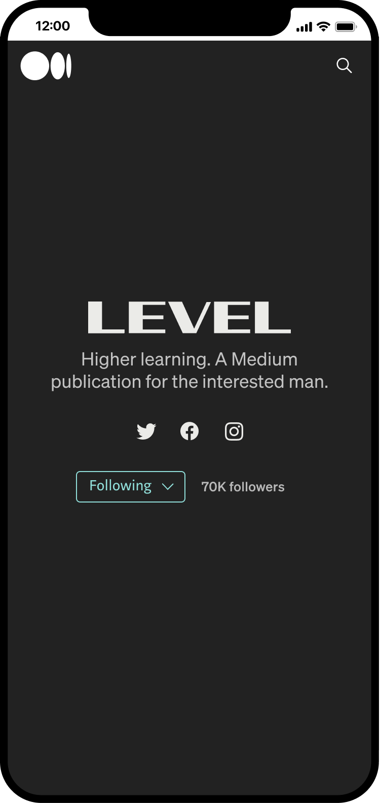
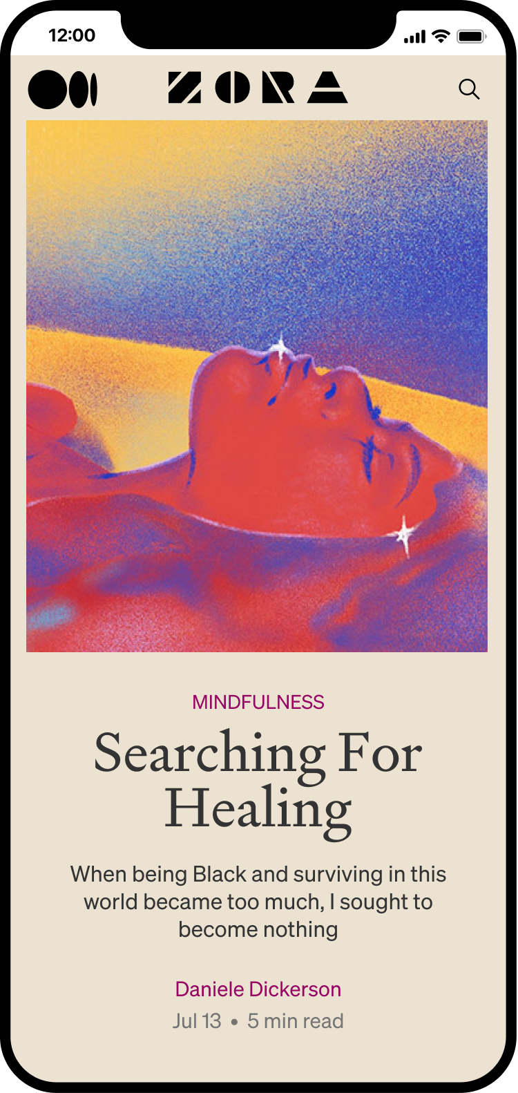
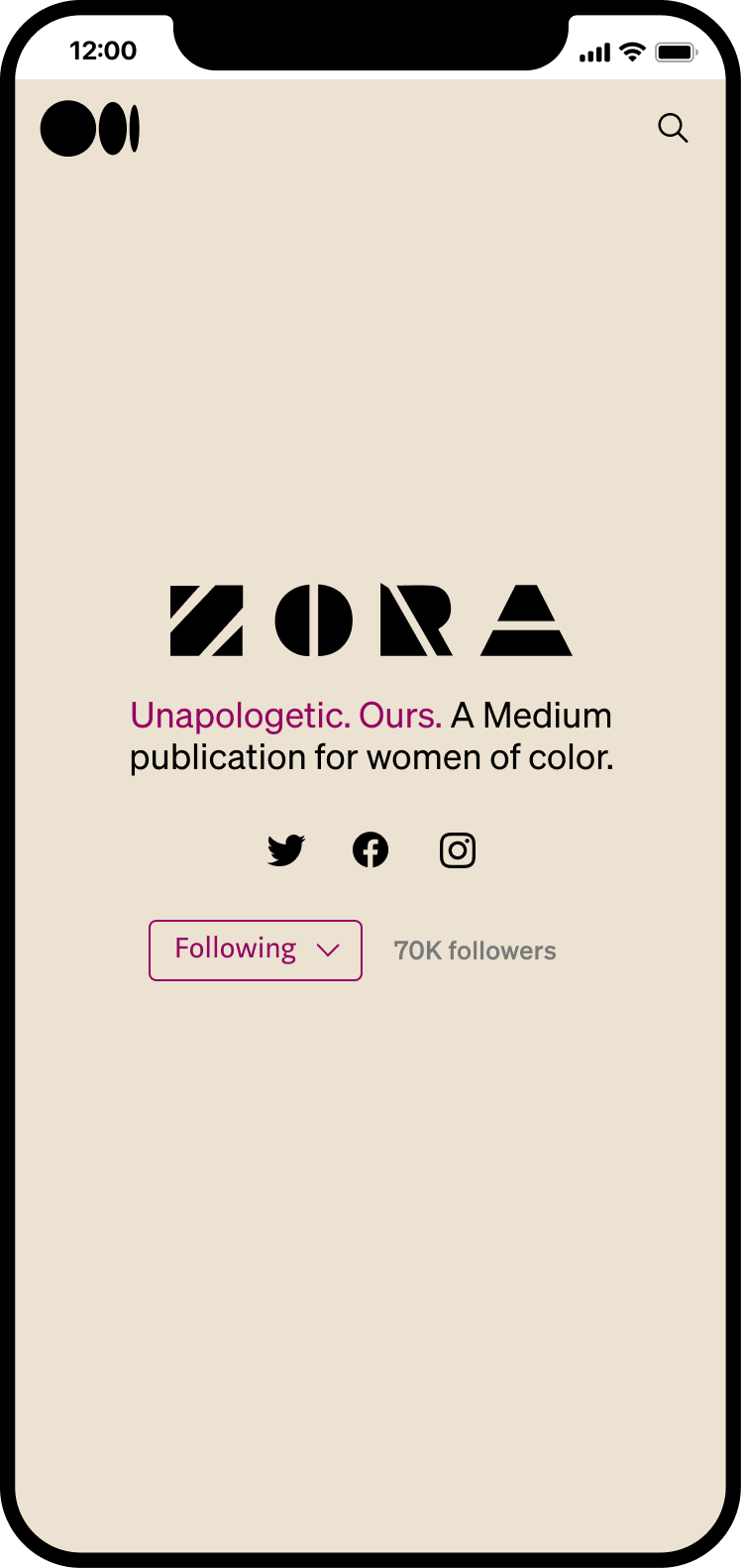
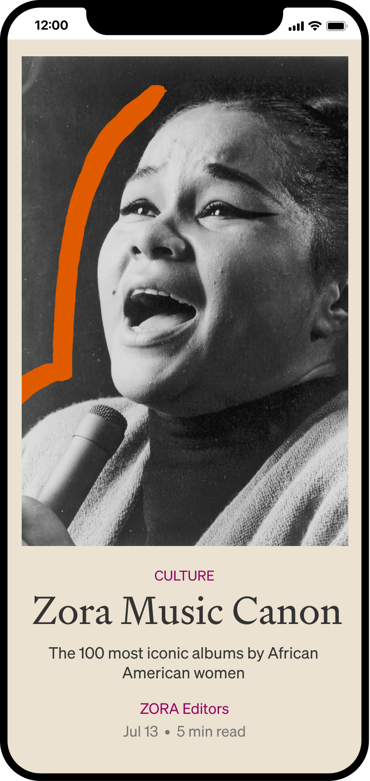
Above you will see mobile web views of two of Medium's publication homepages, Level and Zora. At the time of this design work the majority of users experienced Medium.com via mobile web. There is an emphasis on opening up vertical spacing, strong, unified type, and a revisiting of color palettes per publications.
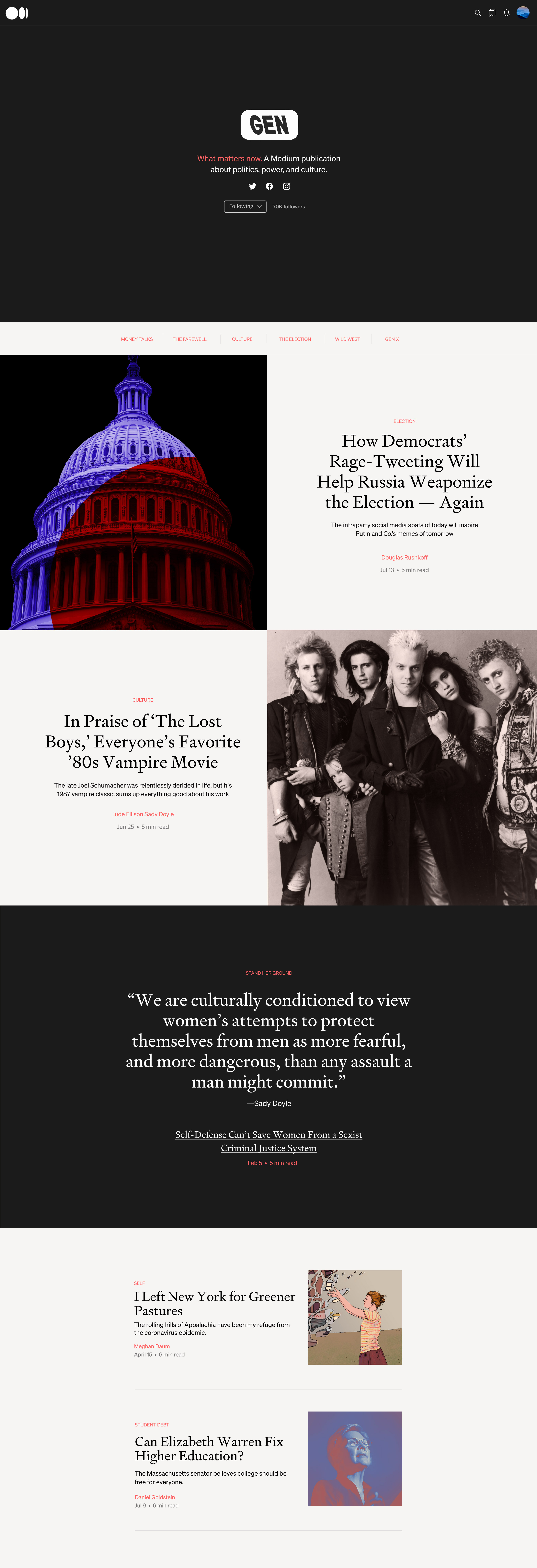
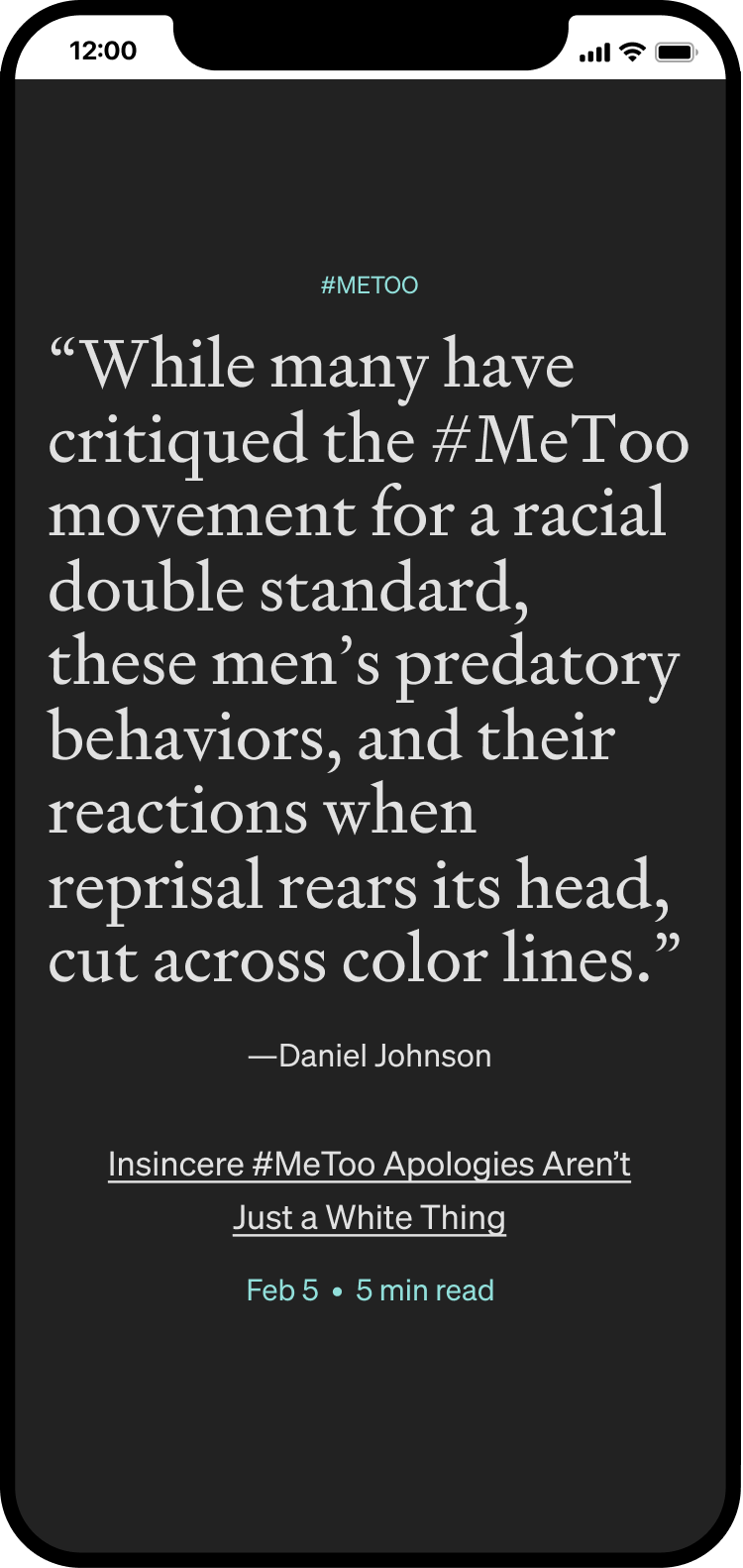
An example of a desktop view above: Following the title of the publication, GEN's homepage presents large "Feature" sections, where publications have the ability to highlight flagship editorial pieces. The following section features full-page pullquotes, which intentionally underscores Medium's mission to put the strength of the written word and good ideas first, through bold typography.